Case study / Product design + Design sprints
Afound Design Sprints
Five design sprints revisiting the mobile journeys of a fashion marketplace after its MVP launch.
Afound
UI/UX Designer
Product design, Design sprints, E-commerce
What needed to change
Afound had launched with a broad range of products and categories. The mobile experience exposed friction in navigation, filtering, product details, editorial publishing, and checkout. The work needed to make those journeys clearer for shoppers while easing production for content editors.
What I owned
I worked on UI and UX design across the five sprints, translating findings into revised mobile flows and before-and-after interface proposals. The original presentation describes the work as a team effort.
Building the answer
Shorten the route to products
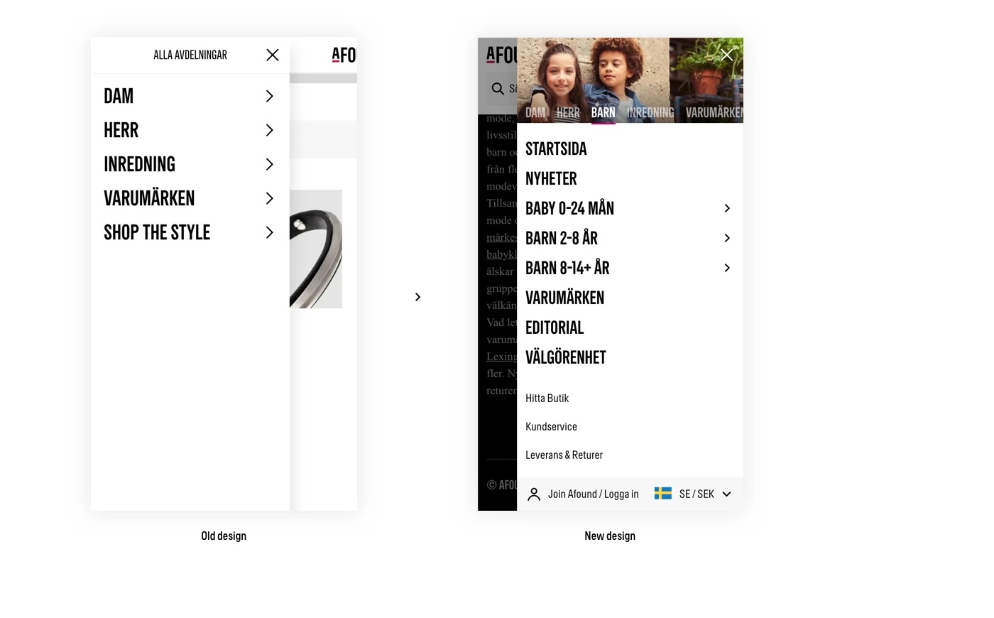
The original mobile menu could require four levels of navigation before a shopper reached a product list. The proposed structure put the main department in tabs and made the final category choice optional on the listing page, reducing the designed path from four levels to two.
The sprint also refined menu hierarchy, selected-department imagery, and supporting links. Sign-in and region controls moved into the menu after user testing.
Make filtering work on a small screen
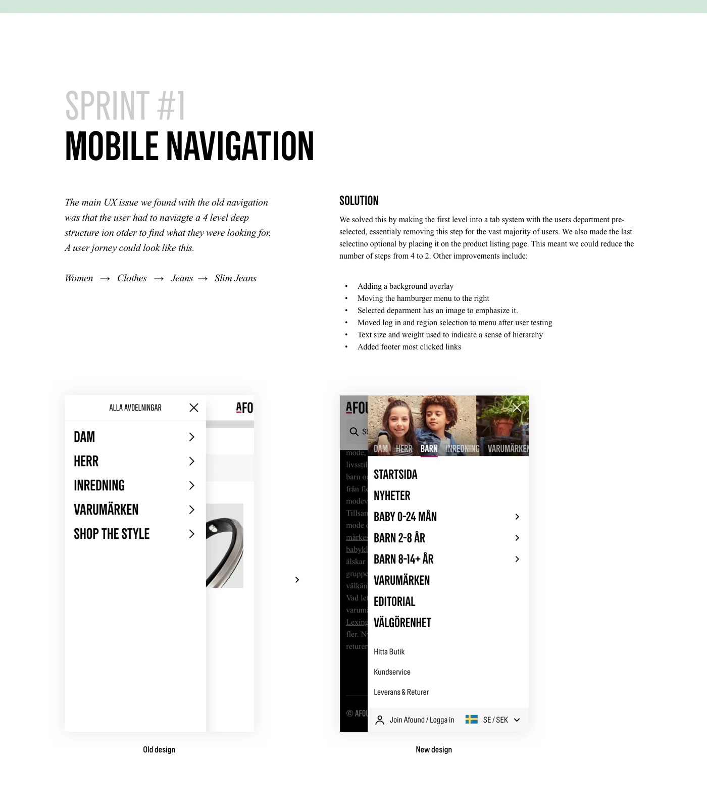
The product-listing filter had performance problems and retained desktop-first interaction patterns. A close-and-save action prevented a request after every selection; larger checkboxes, clearer expansion affordances, and a checkbox-based price choice improved touch use.
Selected filters moved outside the accordion so the interface would not jump when a choice was made.
Put size and product information in view
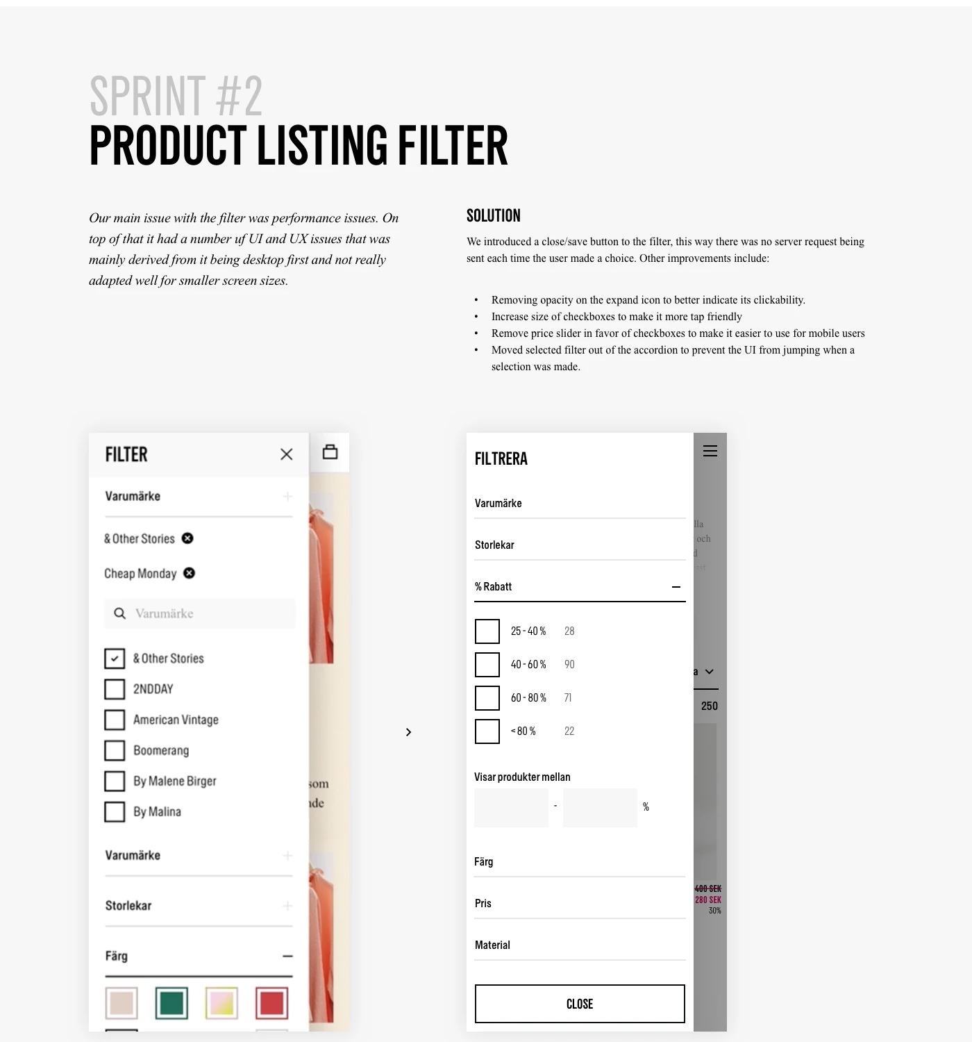
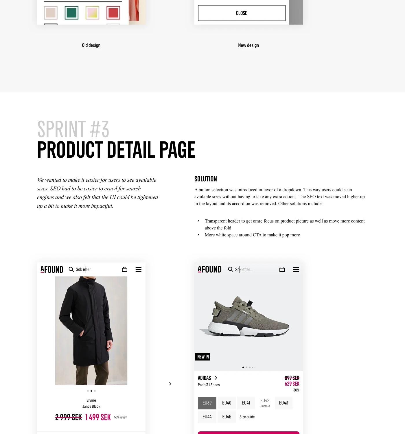
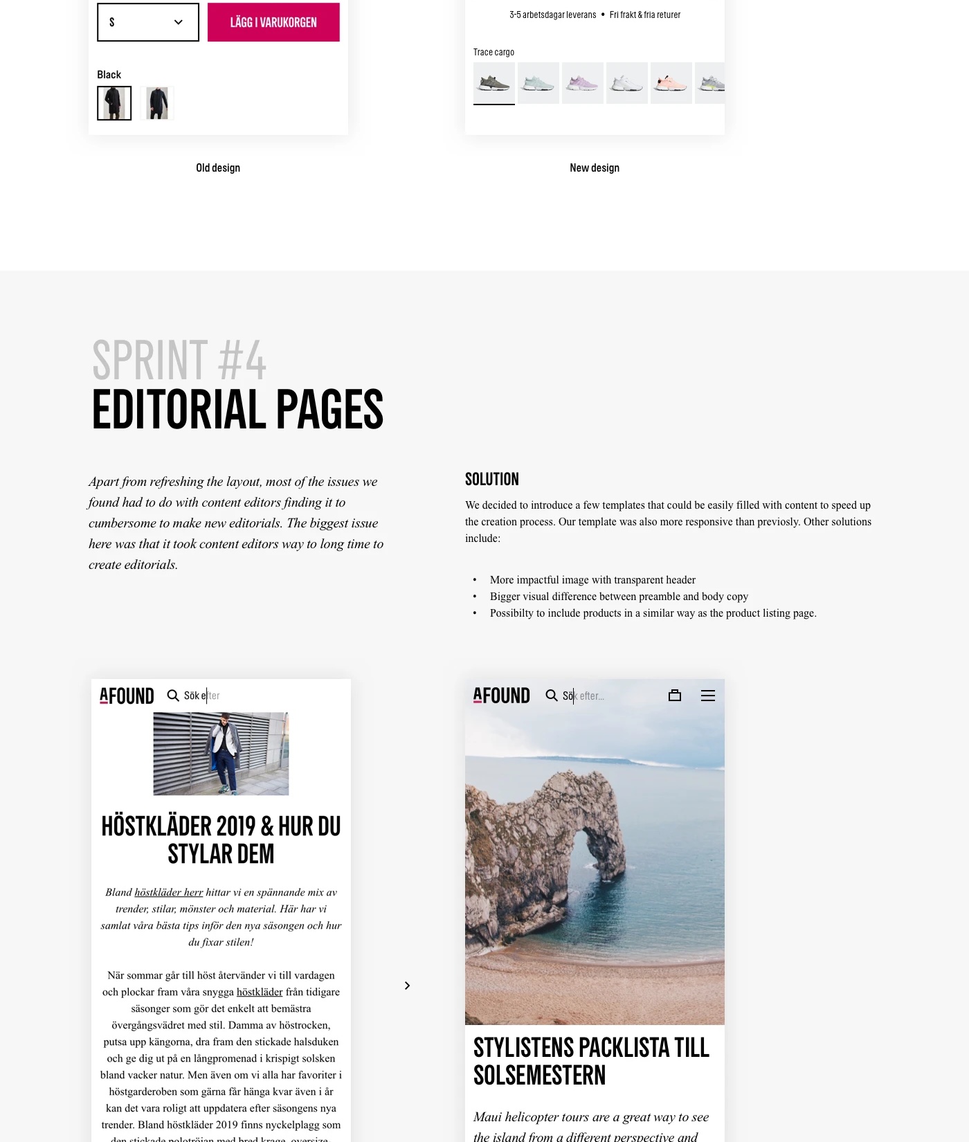
A button-based size selector replaced the dropdown so available sizes were visible without another action. Product information and search-relevant copy moved higher in the layout instead of sitting inside an accordion.
The revised layout also gave the product image more prominence and more breathing room around the add-to-basket action.
Make stories easier to produce
Content editors found new editorial pages slow to assemble. Reusable templates gave them a more responsive starting point and a clearer relationship between the hero image, introduction, body copy, and related products.
Explain the journey as it unfolds
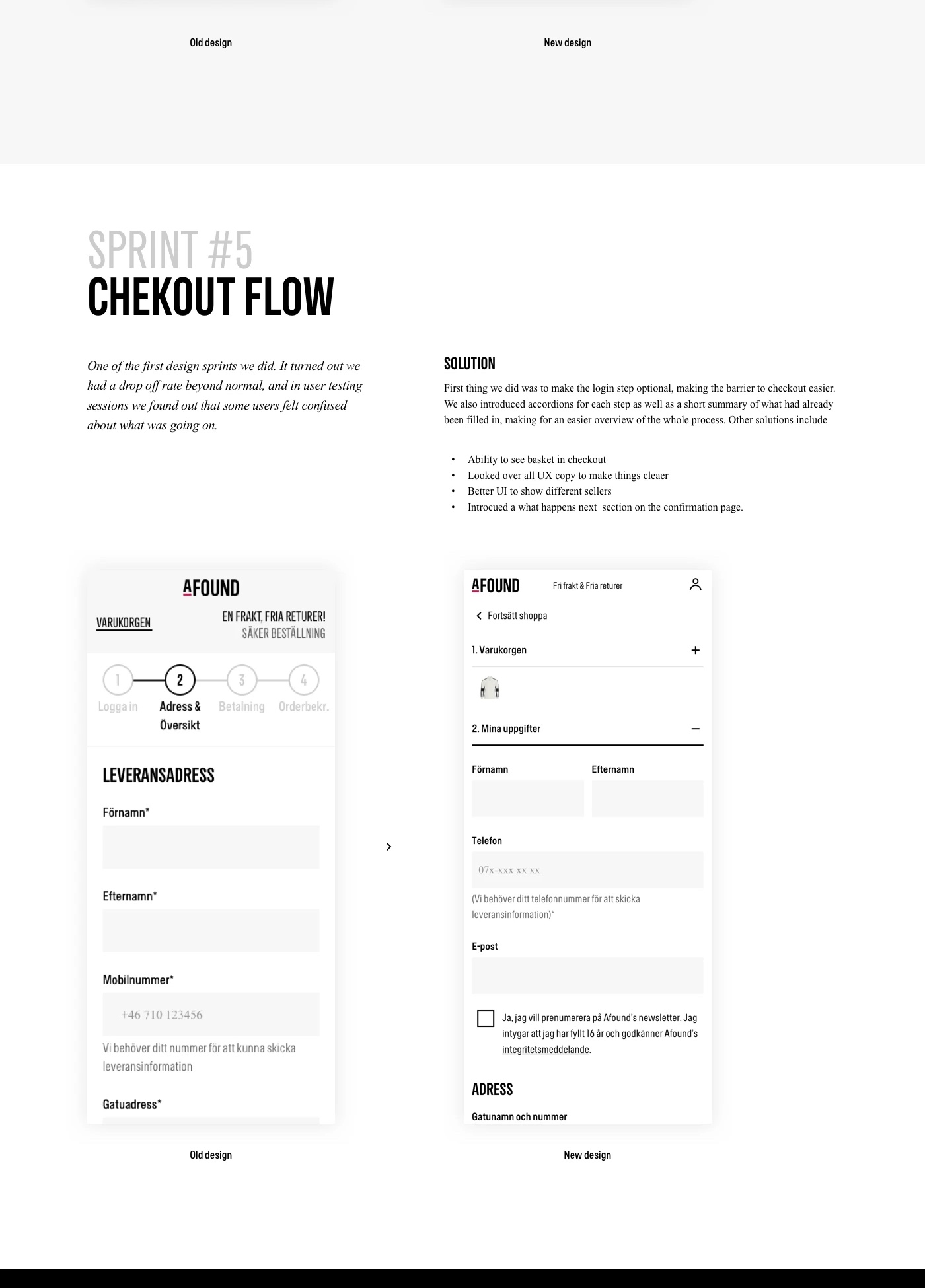
The team saw an unusually high checkout drop-off, and user testing found that some shoppers were unsure what was happening. The proposed flow made sign-in optional, used accordions and summaries to show progress, and kept the basket available during checkout.
The sprint also reviewed UX copy, clarified how different sellers were shown, and added a what-happens-next section to the confirmation page.
A decision that shaped the work
The filter originally sent a server request after every selection. Adding an explicit close-and-save action introduced one deliberate step, but avoided repeated requests while shoppers were still choosing filters.
What changed
- Five documented before-and-after proposals across core marketplace journeys.
- A navigation structure designed to reduce the route to product listings from four levels to two.
- A clearer mobile filter, product detail, editorial, and checkout experience.
Evidence in the work
- User testing informed menu placement and exposed confusion in checkout.
- The original and revised screens make each interaction change visible.
- The editorial template addressed a specific production problem reported by content editors.
The value of the sprint format was focus: one costly source of friction at a time, with a concrete before-and-after proposal that the team could evaluate.