Case study / Design systems + Accessibility
Entercard Design System
A modular, multi-brand design system built to help a small design team deliver consistent financial experiences across web and native apps.
Entercard Group
Senior Product Designer
3 years
Design systems, Accessibility, UI craft, Typography
What needed to change
Entercard’s product team had a growing backlog and limited design capacity. As the second designer on the team, I saw inconsistencies emerge across portals and apps while design decisions were often made late in delivery. The challenge was to improve the experience and the team’s way of working without adding unnecessary process.
What I owned
As the second designer, I designed and maintained shared UI foundations, created the icon set and token structure, connected design decisions to implementation, and coached teammates through changes in handoff and use.
Building the answer
A system that could grow with the team
We set a long-term direction for a centralized system, then began with a small federated setup. A roadmap and shared process made the work manageable alongside day-to-day product delivery.
The goal was a clearer way for designers, developers, and stakeholders to make repeatable decisions while protecting each brand’s expression.
Shared parts, swappable brands
We used atomic design principles and separated foundations from components and product production. Brand, typography, and icon layers could be swapped quickly, making it practical to test different visual directions without rebuilding the interface.
The modular structure supported both app and web work and made the system easier to maintain as the number of use cases grew.
A coherent set that could ship
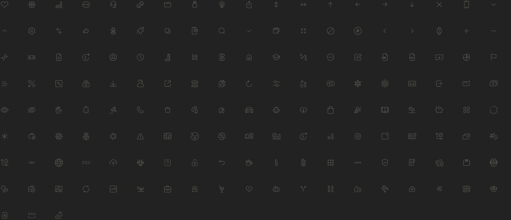
I built an icon set using shared keylines and anatomy. I also prepared export-friendly versions with simpler layer structures, reducing file weight for production while keeping the design source easy to edit.
Brand variation without drift
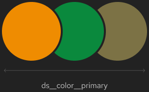
We used Figma library swapping and later variables to keep brand variants aligned. Color and typography were expressed as base and semantic tokens, giving teams a shared language for decisions across brands and platforms.
A GitHub repository held the token definitions, connecting design decisions more closely to implementation and helping the UI stay consistent as the system expanded.
Design maturity is a team practice
The system grew in an organization that had only recently added designers. I spent time coaching developers, showing stakeholders the value of a stronger user experience, and changing established handoffs while continuing to design and maintain the system.
Showing real product examples was more effective than selling an abstract future state. Documentation and careful decisions take time up front, but they give teams a more dependable base for later work.
A decision that shaped the work
A centralized system was the long-term goal, but a small team could not stop product delivery to build it all at once. We began with a federated setup and swappable brand layers, proving the shared foundations before extending them.
What changed
- A modular foundation for shared components across multiple brands, web portals, and native apps.
- Design tokens and iconography connected to production needs.
- A working proof of concept with growing internal use, while the longer-term system continued to evolve.
Evidence in the work
- A working proof of concept showed how the library could adapt across brands and platforms.
- Token definitions in GitHub gave development teams a concrete implementation reference.
- The shared library gained internal use while the broader system remained in progress.
A design system is never finished. The important progress here was establishing a simple, credible foundation that teams could use while the organization’s design practice matured.