Case study / Design systems + Accessibility
SL Design System
Translating Stockholm public transport’s established visual identity into a digital system that could work across services, screens, and teams.
Trafikförvaltningen / SL
Lead UI / Design Systems Lead
2 years
Design systems, Accessibility, Product design
What needed to change
SL had recently launched a new website and app, but their teams worked in silos. The products improved on what came before, yet shared patterns and brand consistency were limited. A digital foundation had to respect SL’s recognizable identity while giving product teams practical tools they would actually adopt.
What I owned
I led the UI and design-system work: iconography, digital pictograms, typography and color foundations, product mockups for validation, and the feedback process with product teams. The website and app had launched before this work began.
Building the answer
Start small, then learn in use
I led the UI and design system work for SL. We reviewed brand manuals and existing touchpoints, then chose a small initial foundation rather than trying to define every component up front. A short first build gave teams something concrete to use and critique.
We set up recurring conversations and feedback routes with product teams. That kept the system connected to real work and gave us a way to improve it as new needs appeared.
An icon language built from the brand
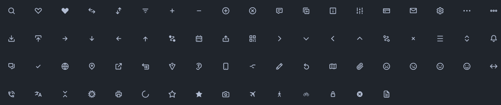
I created a new UI icon set inspired by SL’s custom typeface. Whitespace, corner radius, stroke width, and pixel alignment became shared rules, so icons could feel like one family across digital products.
I documented the anatomy and usage guidance to make the set easier to extend without losing its character.
Carry familiar station symbols into digital
The transport environment already had a rich set of pictograms. I inventoried those assets and rebuilt them on a 24 × 24 pixel canvas, preserving their identity while making them usable in digital interfaces.

Type and color for more than one screen
SL’s custom typeface needed a scale that considered viewing distance as well as phones and laptops. I defined a type hierarchy using a baseline grid and an 8-point soft grid, with room for the larger formats used in transport.
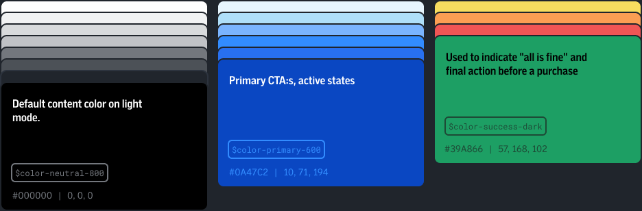
The color system extended established brand colors with defined usage, light and dark modes, and contrast checks against WCAG 2.1 AA. Spacing, radius, layout principles, tone of voice, and usage guidance completed the first set of foundations.
Stress test before release
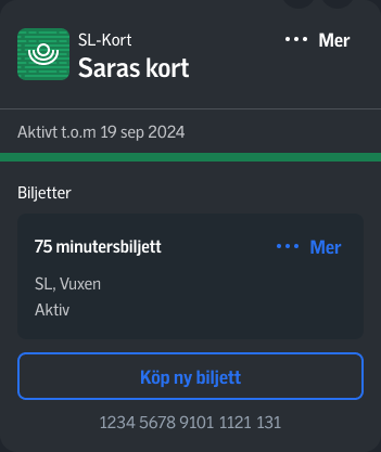
Before releasing the system to product teams, we made our own interface mockups across platforms, scenarios, and modes. The exercise exposed gaps in the foundations and led to another round of iteration. The ticket flow shown above is one example of that stress test.
Make the system useful to the teams
The hardest part was timing. The website and app were new, so another workflow change was a difficult sell. We worked closely with the teams on their immediate needs, built trust through practical help, and included designers and developers in decisions about what to make next.
Presentations across the organization explained the purpose of the system, while feedback loops gave teams a role in shaping it. The system was established and ready for further iteration when I left.
A decision that shaped the work
We could define a complete library before anyone used it, or release a smaller foundation that teams could test in real work. We chose the smaller start, accepting more iteration in exchange for concrete feedback and a better chance of adoption.
What changed
- A digital foundation spanning iconography, pictograms, typography, color, layout, and usage guidance.
- A working feedback and adoption process with product teams.
- A system tested in realistic product scenarios and positioned for continued iteration.
Evidence in the work
- Interface mockups across platforms and modes exposed gaps that were revised before release.
- Documented icon and pictogram rules made the visual language repeatable for product teams.
- Recurring feedback and organization-wide presentations established a route for continued adoption.
For an established service brand, the work was as much about earning adoption as drawing components. Starting with a small usable system made it possible to learn with the teams.