Case study / Mobile UI + Visual systems
ComeOn Mobile Site
A mobile visual direction spanning content discovery, account, payment, and sports experiences.
ComeOn
UI/UX Designer
Mobile UI, Visual systems, Iconography
What needed to change
The screens in this project cover very different kinds of content: game discovery, sports information, navigation, account management, and payments. The design challenge visible in the work is to give those surfaces a coherent mobile language without flattening their differences.
What I owned
My contribution shown here is the mobile UI direction and the supporting visual system: color and type foundations, iconography, surface patterns, cards, and example screens. The original presentation does not state which screens shipped.
Building the answer
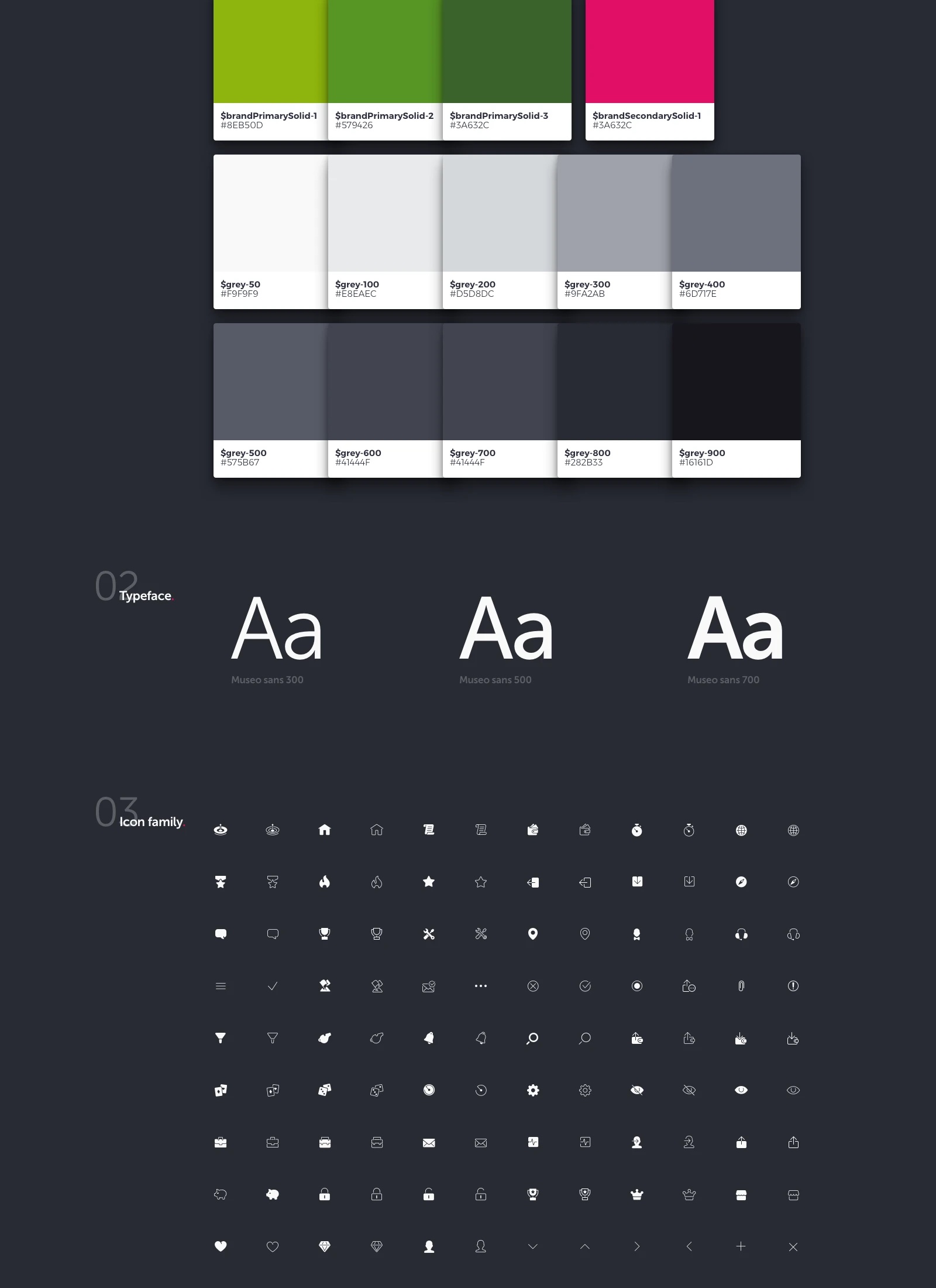
Set the visual vocabulary
The presentation defines green and pink brand accents, a stepped neutral palette, Museo Sans weights, and a compact icon family. These foundations give the later screens a common vocabulary.
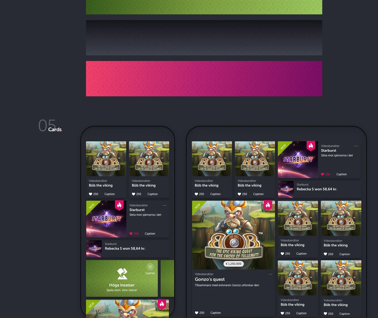
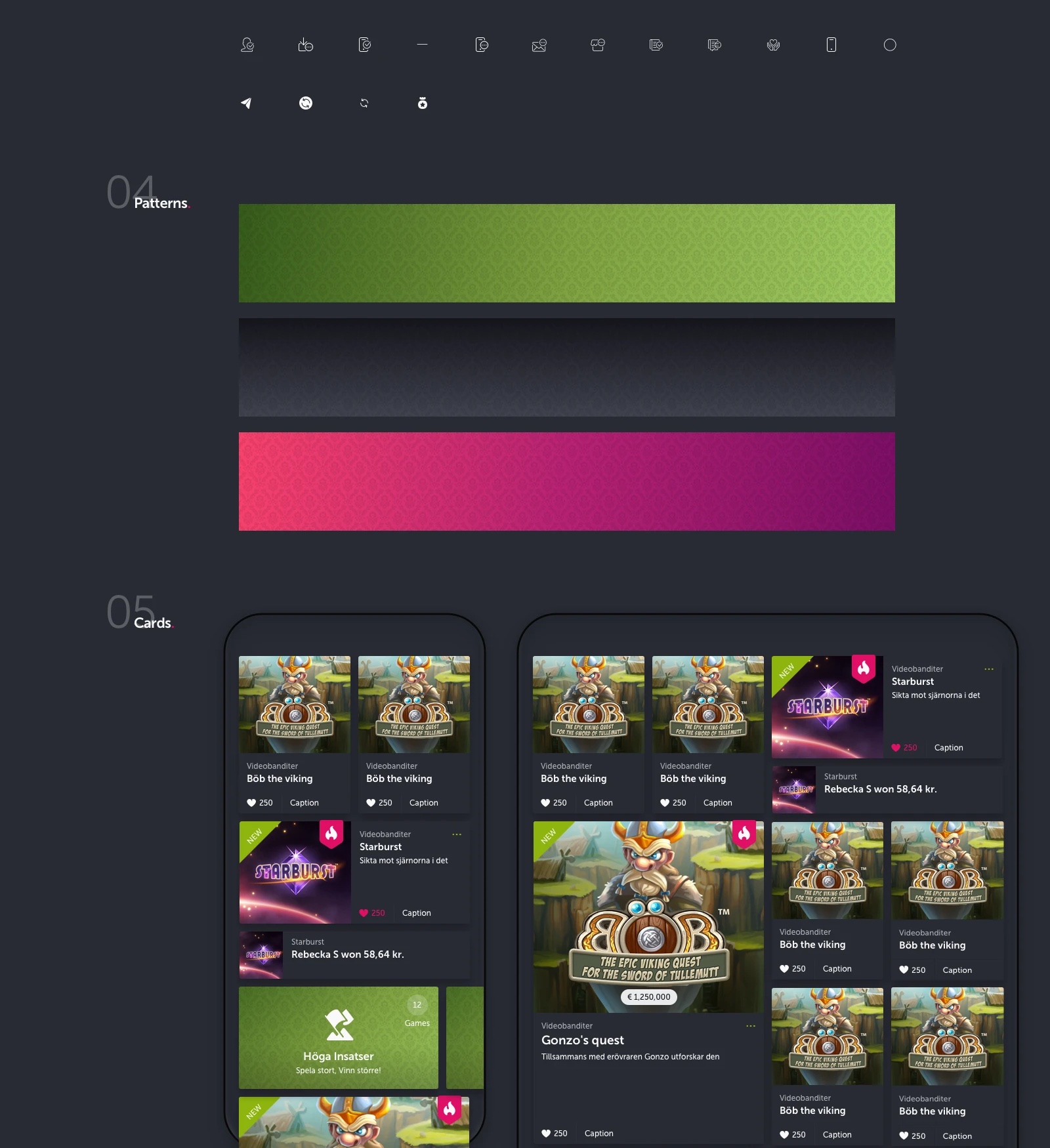
Make content cards repeatable
Game and promotion cards use common image, metadata, label, and action patterns. The examples show how the same content unit can adapt to narrow and wider arrangements without losing its identity.
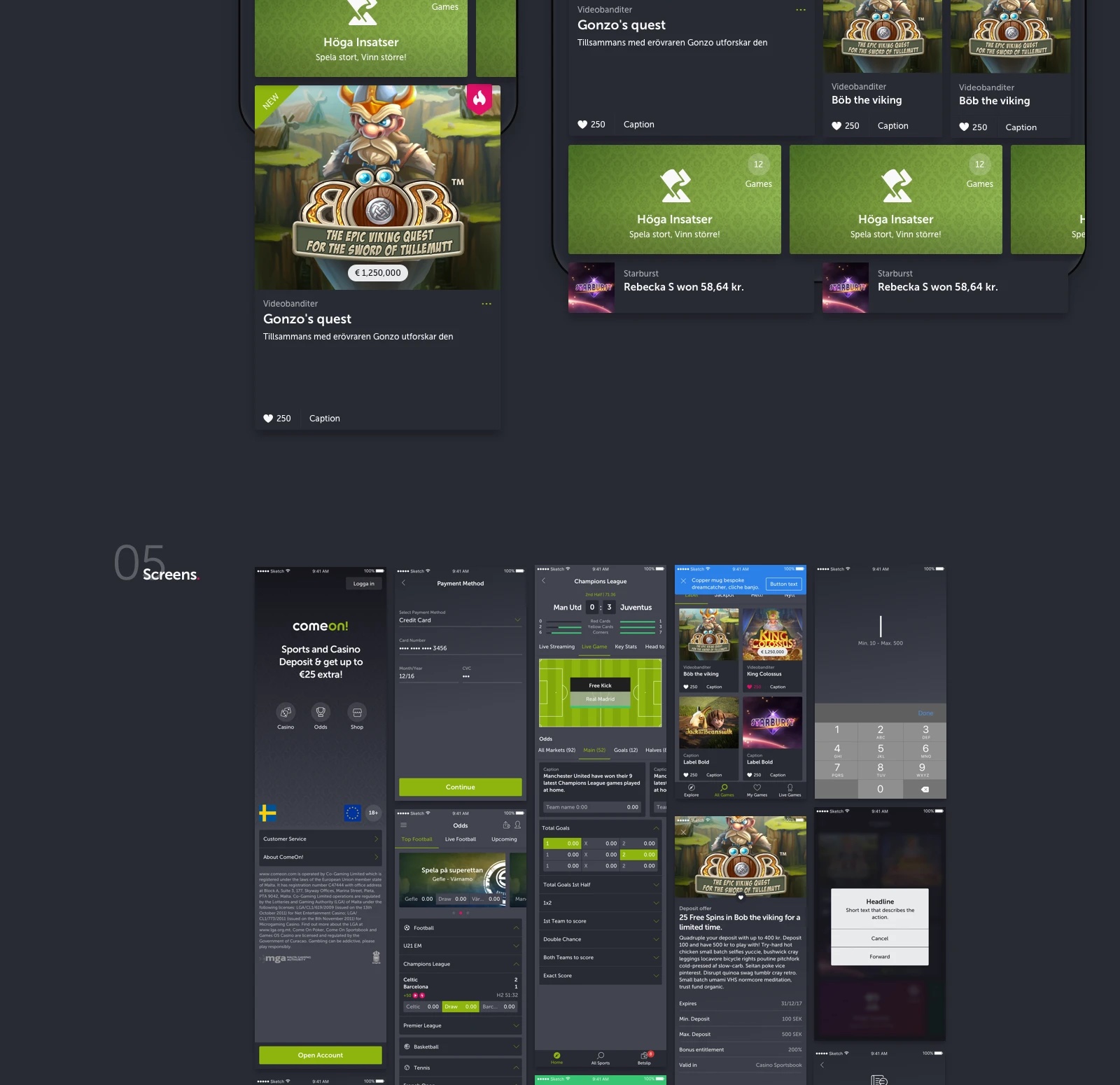
Test the language across journeys
The screen set applies the visual language to casino discovery, sports listings, sign-in, account, payment, offer, and utility views. Showing them together tests whether the system can serve both expressive content and more functional tasks.
A decision that shaped the work
The design uses dark surfaces to hold dense content, with lime and pink reserved for stronger brand and action moments. That gives the interface a distinctive hierarchy, but it also makes contrast and state clarity important in implementation.
What changed
- A documented mobile visual direction with foundations, components, and screen examples.
- Reusable cards and interface patterns shown across a range of content and account views.
Evidence in the work
- The source presentation contains palette, type, icon, pattern, card, and screen sections.
- The screen collection shows the system applied to several different mobile contexts.
This is a visual case study, not a performance claim. The original material demonstrates range and consistency, but does not document a launch, user-testing outcome, or measured impact.