Case study / Design systems + Multi-brand UI
Multi-brand Sketch Library
A shared Sketch component library that let designers switch brands without rebuilding the interface from scratch.
Multi-brand product team
UI/UX Designer
Design systems, Multi-brand UI, Sketch
What needed to change
The team had no master file. Designers often recreated their own versions of components, and handoff to developers suffered when delivery time was tight. A single template needed to serve UI and UX designers across brands without depending on plugins.
What I owned
I structured the shared Sketch library and its workflow around common components, brand-level styles, responsive symbols, and documented rules. The source presentation describes this as work for a team of UI and UX designers.
Building the answer
Agree on one workflow
The goal was one template for all brands that both UI and UX designers could use quickly. It needed to increase consistency, improve developer handoff, remove plugin dependencies, and give every new component a common set of rules.
Use native Sketch styles
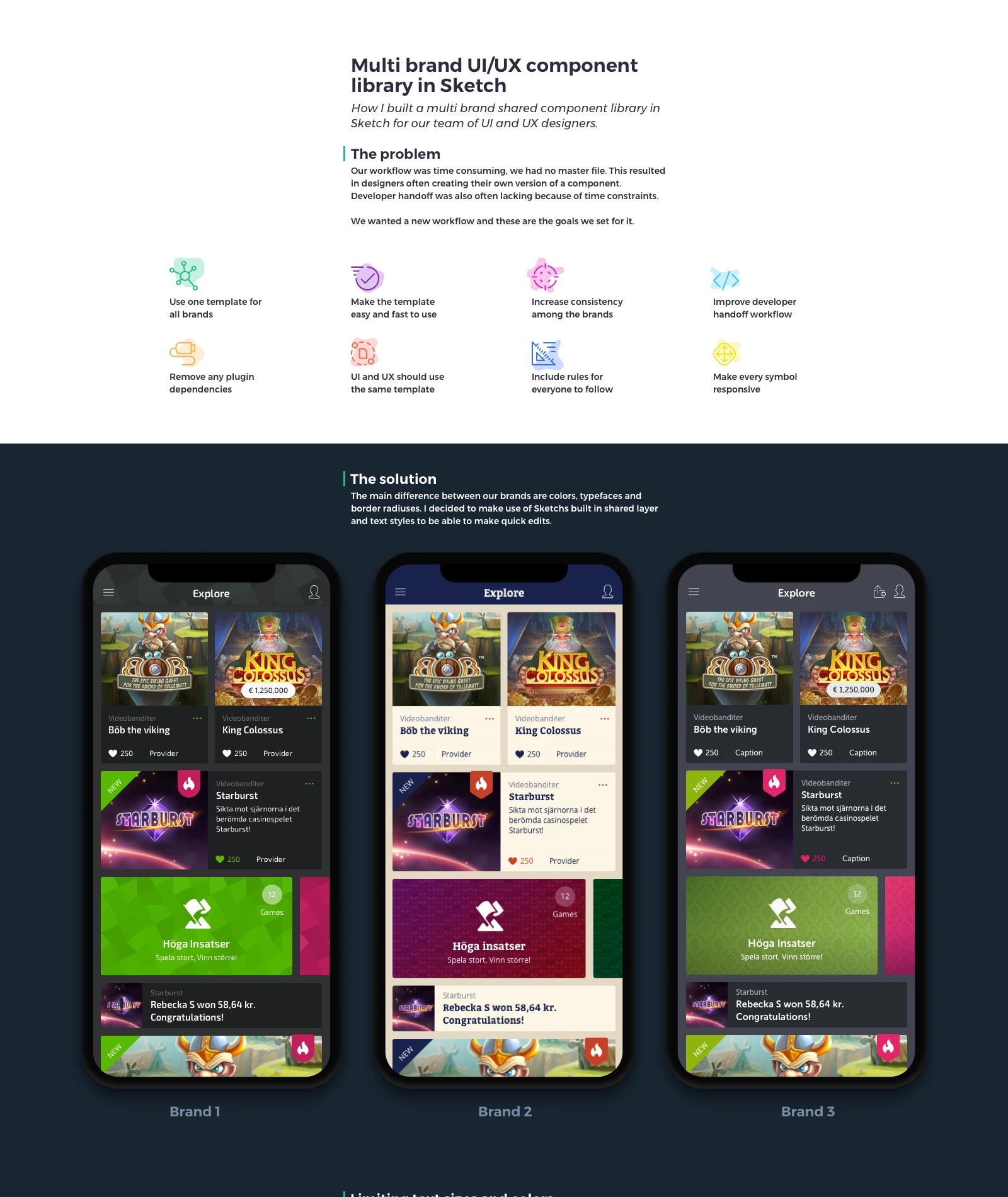
The main differences between brands were color, typeface, and border radius. Sketch shared layer and text styles let the team make those changes at the brand level while keeping the component structure stable.
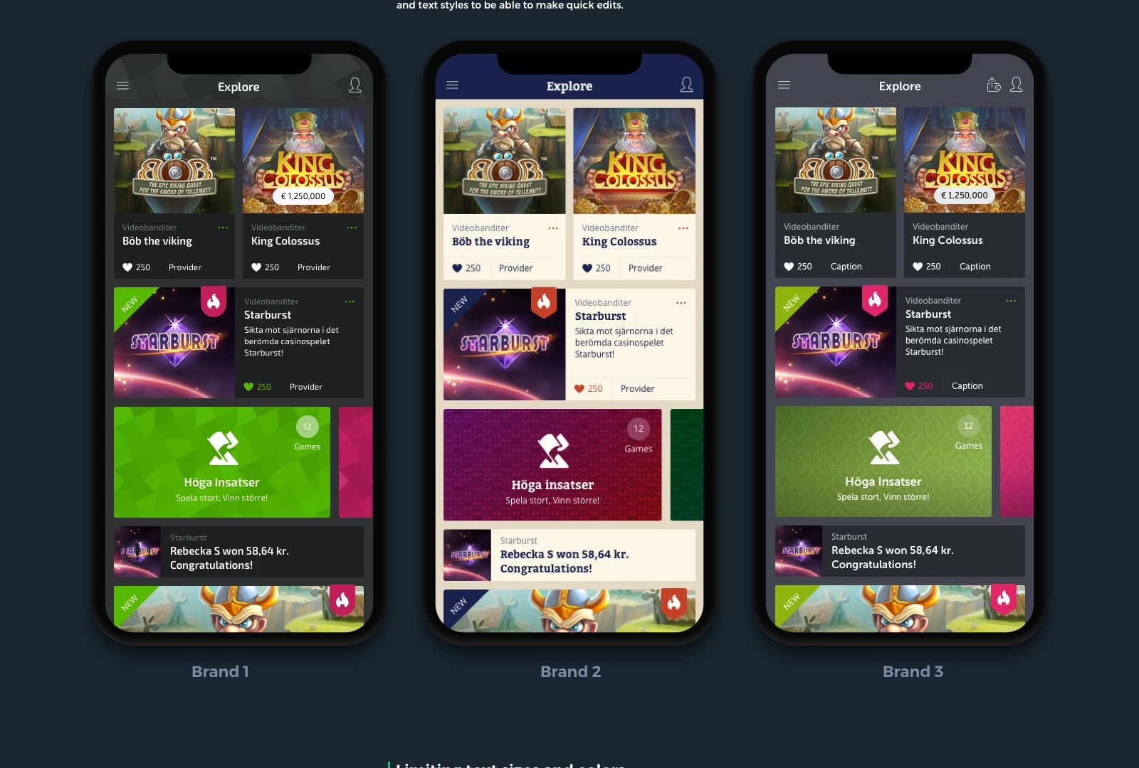
The presentation shows the same Explore screen rendered in three brand treatments.
Limit variation where it mattered
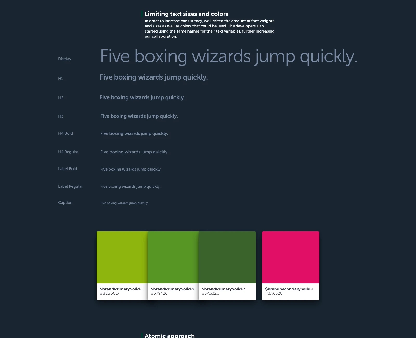
A smaller set of font weights, sizes, and colors helped designers make more consistent choices. Developers began using the same names for text variables, connecting design decisions more directly to implementation.
Build from small parts
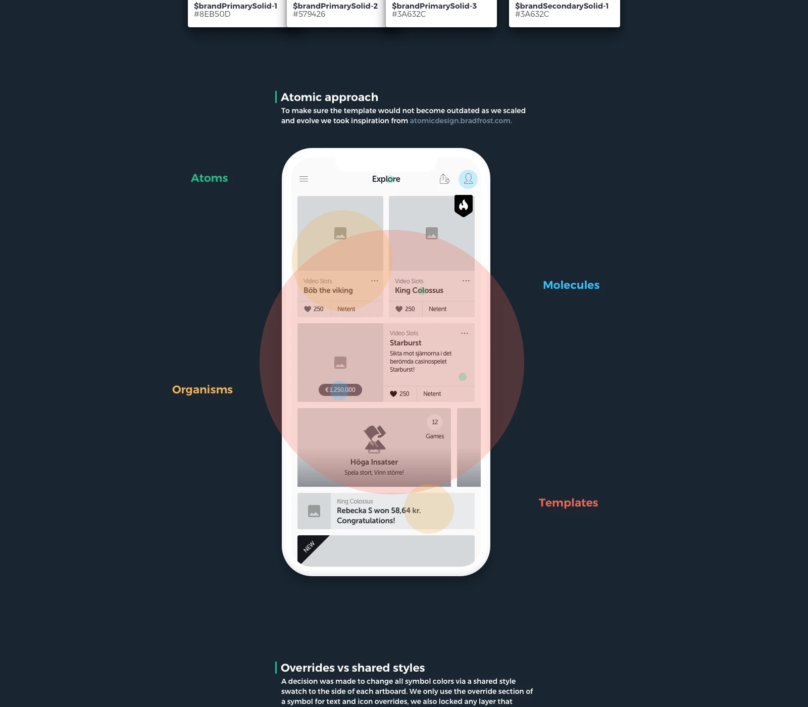
The library used an atomic structure from smaller interface elements through cards and page templates. That made it easier to update a repeated part without rebuilding every screen that used it.
Keep overrides manageable
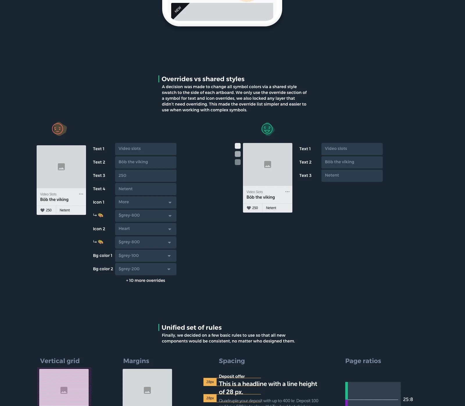
Brand color changes came from shared style swatches alongside the artboards. Symbol overrides stayed focused on text and icons, and locked layers kept complex symbols easier to use.
The team also documented grids, margins, spacing, and page ratios so new components could follow the same system.
A decision that shaped the work
Keeping every color editable as a symbol override would maximize local control but create long, difficult override lists. Shared style swatches handled brand colors; overrides were reserved for text and icons, and unnecessary layers were locked.
What changed
- A shared library for multiple brands with reusable components and page templates.
- A faster route to assemble UX flows and preview a new visual brand across pages.
- A documented set of type, color, spacing, grid, and symbol rules.
Evidence in the work
- The same interface is shown in three brand treatments.
- The source includes type and color scales, a component hierarchy, and side-by-side override examples.
- The original project write-up describes flows assembled in minutes and brand previews in hours rather than days; these are qualitative reports, not independently measured metrics.
The useful abstraction was not one look for every brand. It was one dependable structure that let brand expression change without forcing designers to recreate the product.